

BowlfulDesigning a dog food brand around a bowl licked clean.
Bowlful is meant to be fun first. Its logo is a long-eared dog whose back is a bowl of kibble, a small joke you get at a glance, and the hand-lettered name makes it feel friendly, like a dog that's happy to see you. The shapes stay simple, close to a Japanese minimal mark, so it still holds up on a premium shelf.
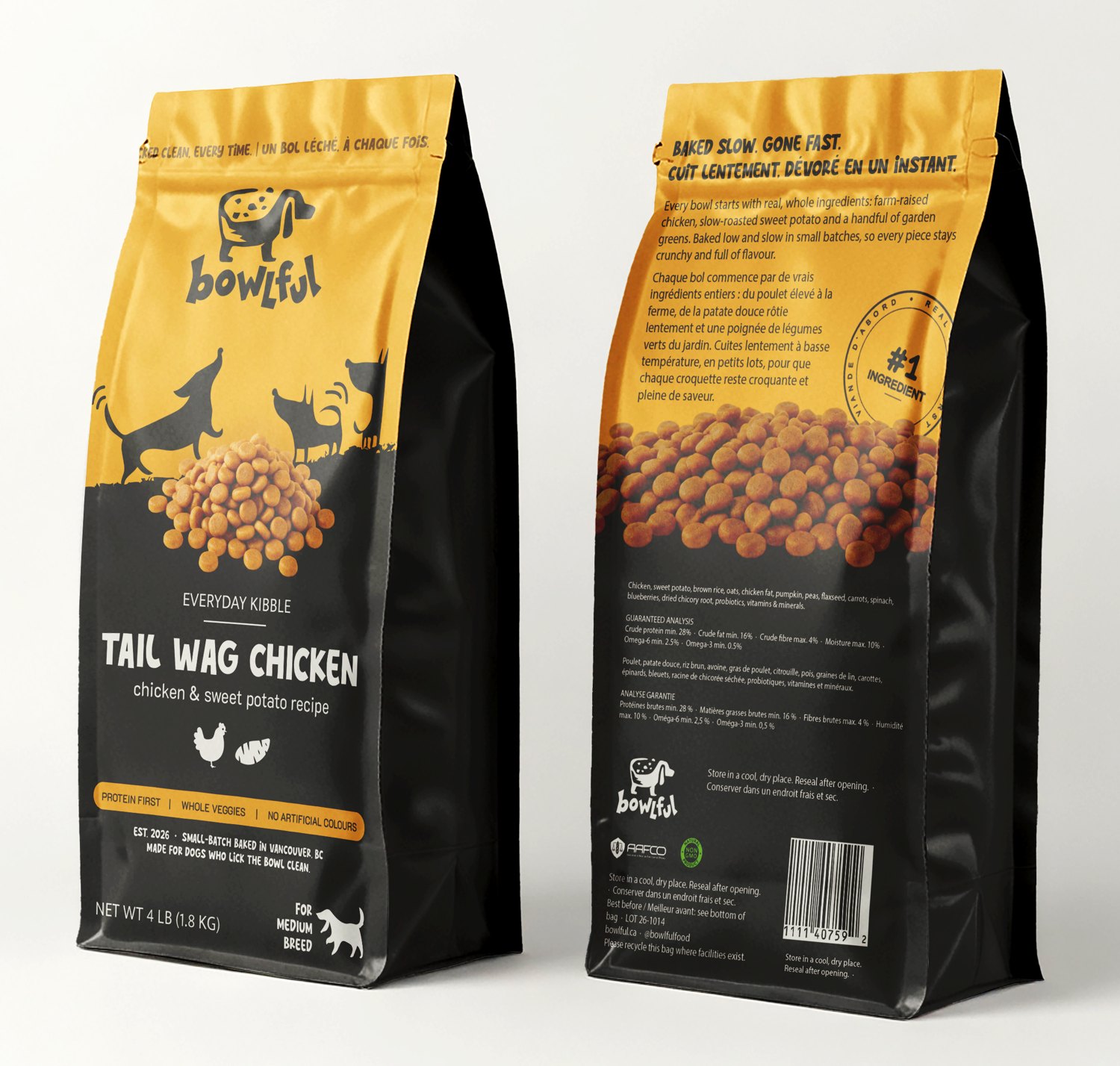
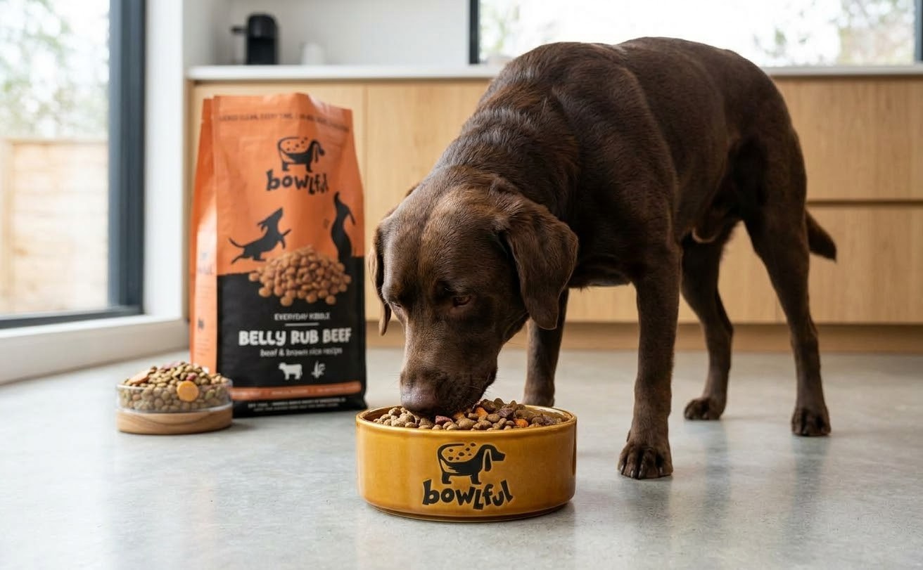
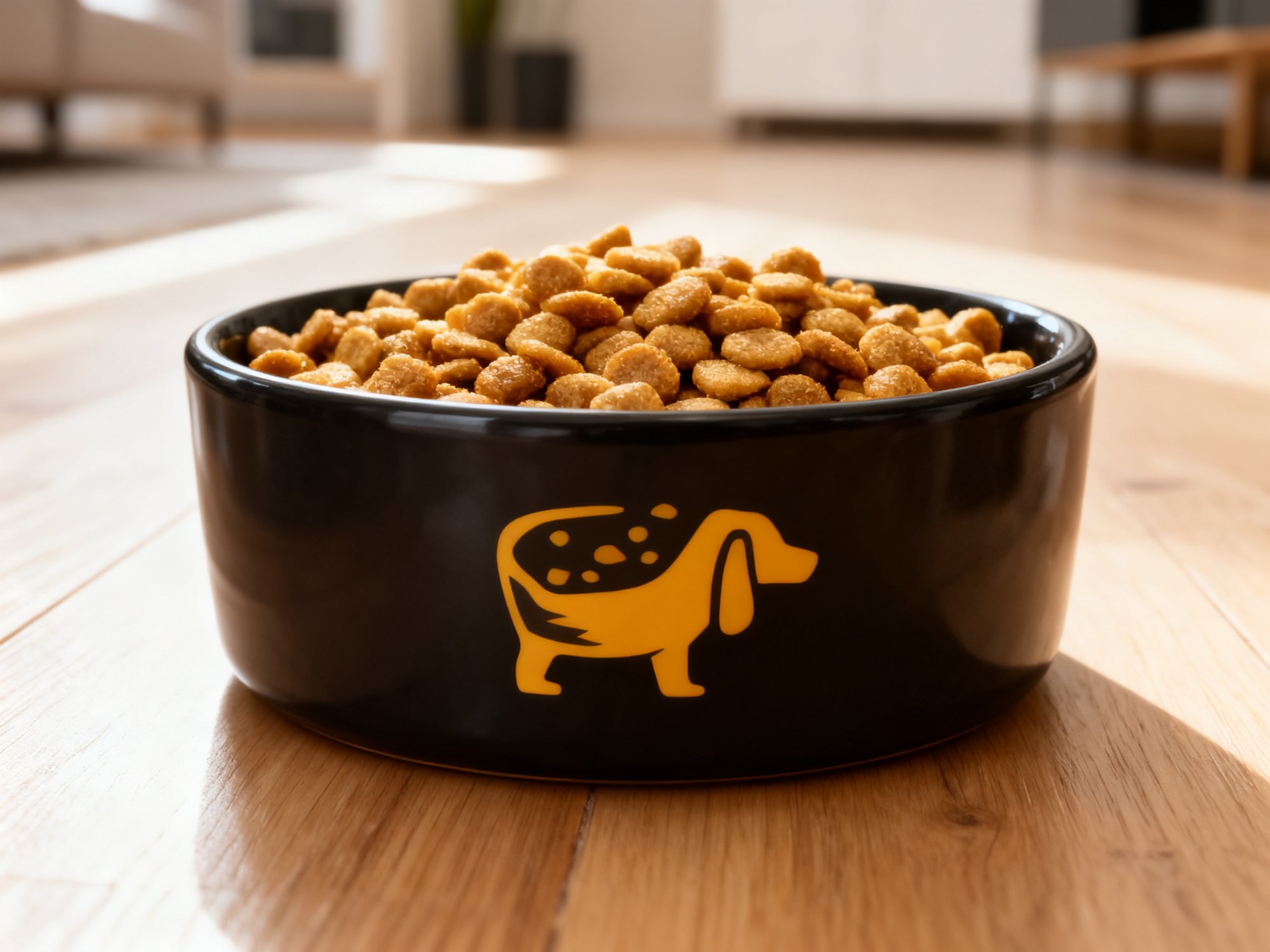
The logo works on a bowl as well as on a bag.
- Made to be handled
- Kibble bags get dragged across shop floors and car boots, and a dark lower half hides the scuffs.
Design notes
Each recipe has its own bright colour on top and black below. Dogs playing in silhouette run along the line where the two meet, and a real photo of the kibble sits on that line. All recipes share one layout, in English and French, so another brand could swap in its own colours, names and photos and keep the structure.
The logo is solid black with no white inside, so it prints in one colour on a bag, a can or a ceramic bowl.
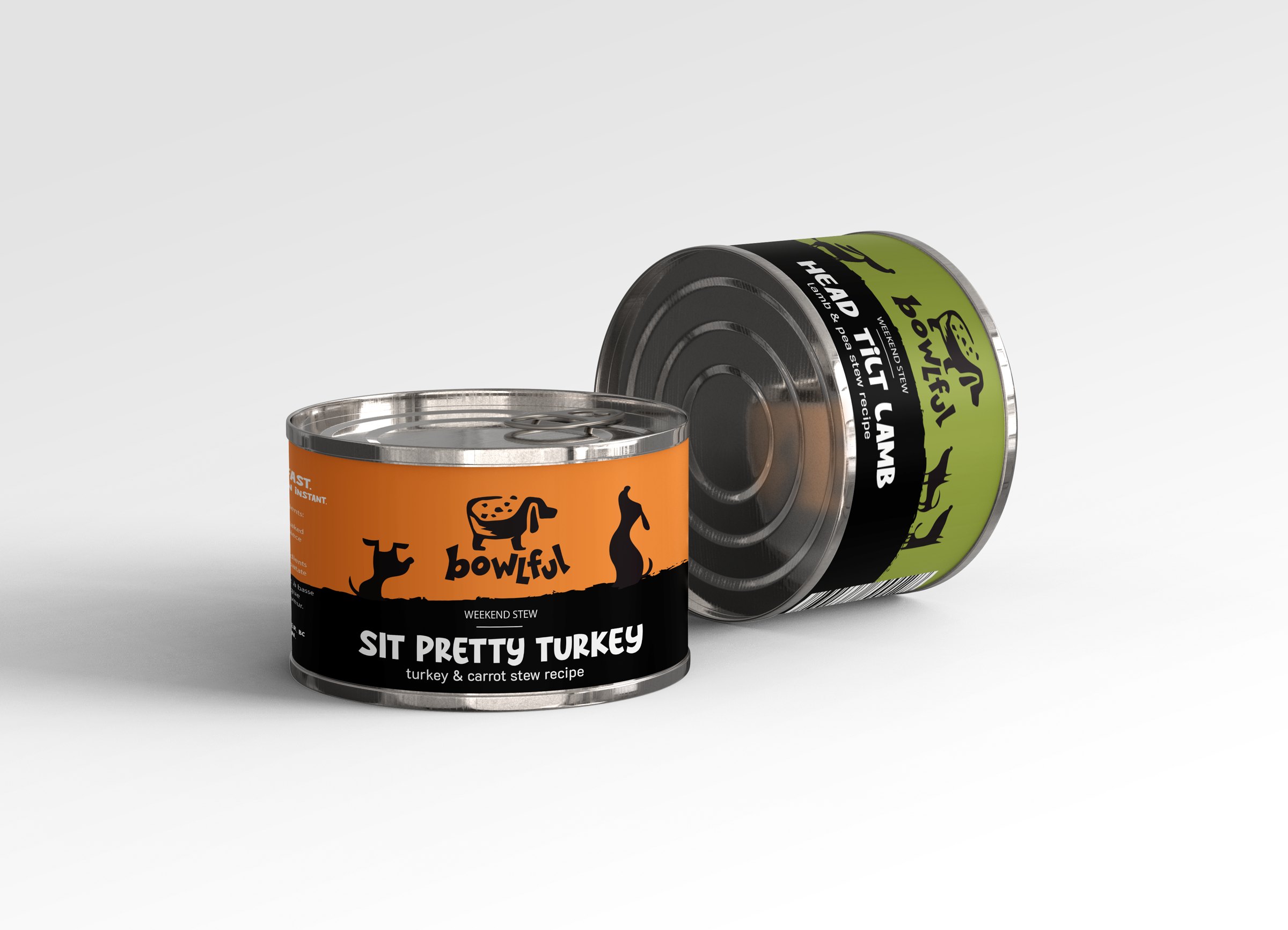
Weekend Stew cans use the same layout and the same kind of nickname as the dry food.
- Weight at the bottom
- Darker surfaces look heavier, so keeping the black low makes the bag look grounded and steady on the shelf.Source: Walker, Francis & Walker, Experimental Psychology, 2010
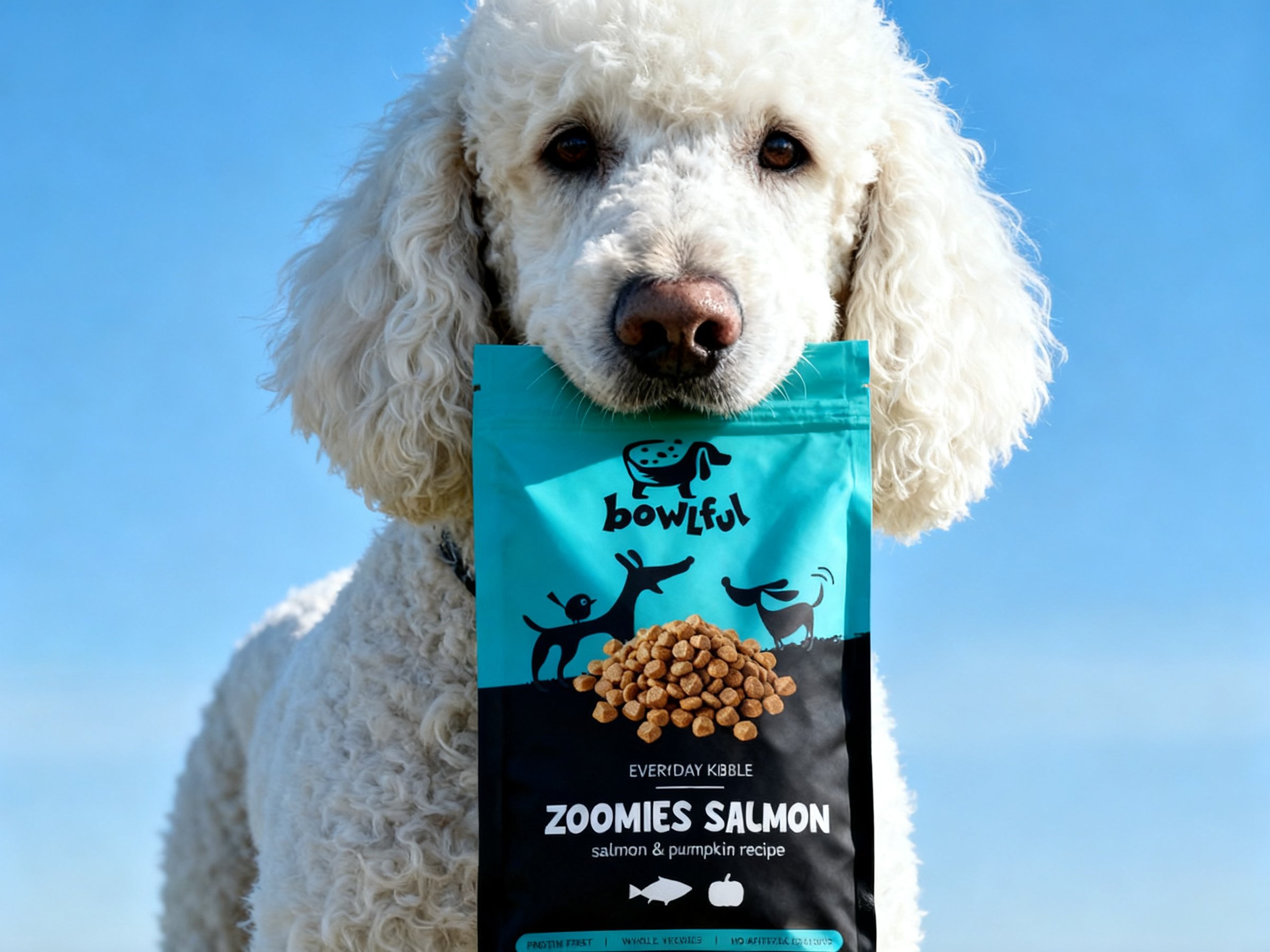
- Real food on the pack
- Product pictures on a pack draw more attention, most of all for a brand shoppers don't know yet, so a real kibble photo sits on the line between colour and black.Source: Underwood, Klein & Burke, Journal of Product & Brand Management, 2001
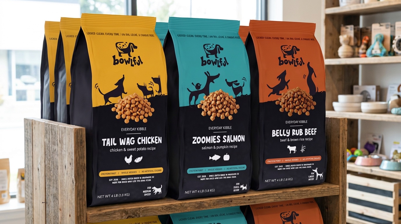
- Colour that stands out
- In a busy pet shop aisle, colour is what helps a pack catch a shopper's eye, so each recipe gets one bold colour on top.Source: Spence & Velasco, Food Quality and Preference, 2018
- Black for a premium feel
- Black on a pack tends to read as premium, so the lower half of every bag is black and the bright colour sits above it.Source: Romeo et al., International Journal of Gastronomy and Food Science, 2022
Bowlful is a sample brand created to show the identity.